 a journal of interesting technical ideas . . .

Home web dashboards serve as a “starting point” for web sessions. Especially as a certain portion of applications now reside online, a home dashboard is a customized menu of the things that you need presented in the way you want. Dashboards could be as simple as a collection of links, or include things like network and server statistics or embedded frames.
Hosting your own dashboard also reduces internet traffic, limits the public data footprint (particularly if you are using it to access local resources), and creates resiliancy (in the sense that local services are still easily accessible if the Internet connection is down).
I have had a hand-coded homepage running on Apache for a long time. I recently tried out some options in Docker and wanted to share the experience.
Before we get into the actual options, we’ll need a brief aside on how to actually have a default page. Browsers used to have a “homepage” setting that showed a certain site whenever a new window opened. Over time, browsers have wanted to “feature” their own content and brand and have made it harder to set a starting point. Browsers change frequently, so these instructions are current as of late 2023.
For Chrome - Google has rolled out a new “Privacy Sandbox” that makes it easier for them to target ads and harder for you to avoid profiling. The best option is to use another browser.
Meanwhile, when it comes to refuting the concepts of privacy and private ownership, Edge says, “Hold my beer”. Again, the best option is to avoid the problem.
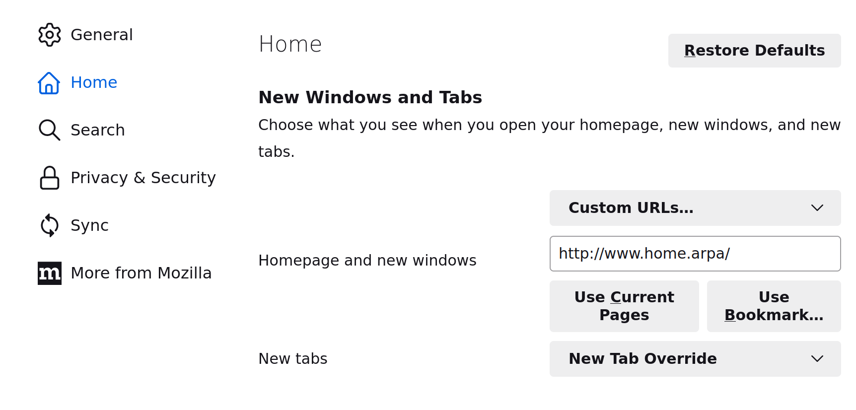 Mozilla is a little bit of a journey sometimes, but I’ve settled on Firefox as a browser that performs well and respects privacy. To set a homepage, go to settings > home and there’s a place to set the homepage. Even Firefox wants to land you on a page they control though - this setting only works for new windows and clicking the “home” button. Under “New Tabs” the only options are blank page and Firefox Home (Default). In the good old days, you could pick your own default! To fix this I use the New Tab Override extension.
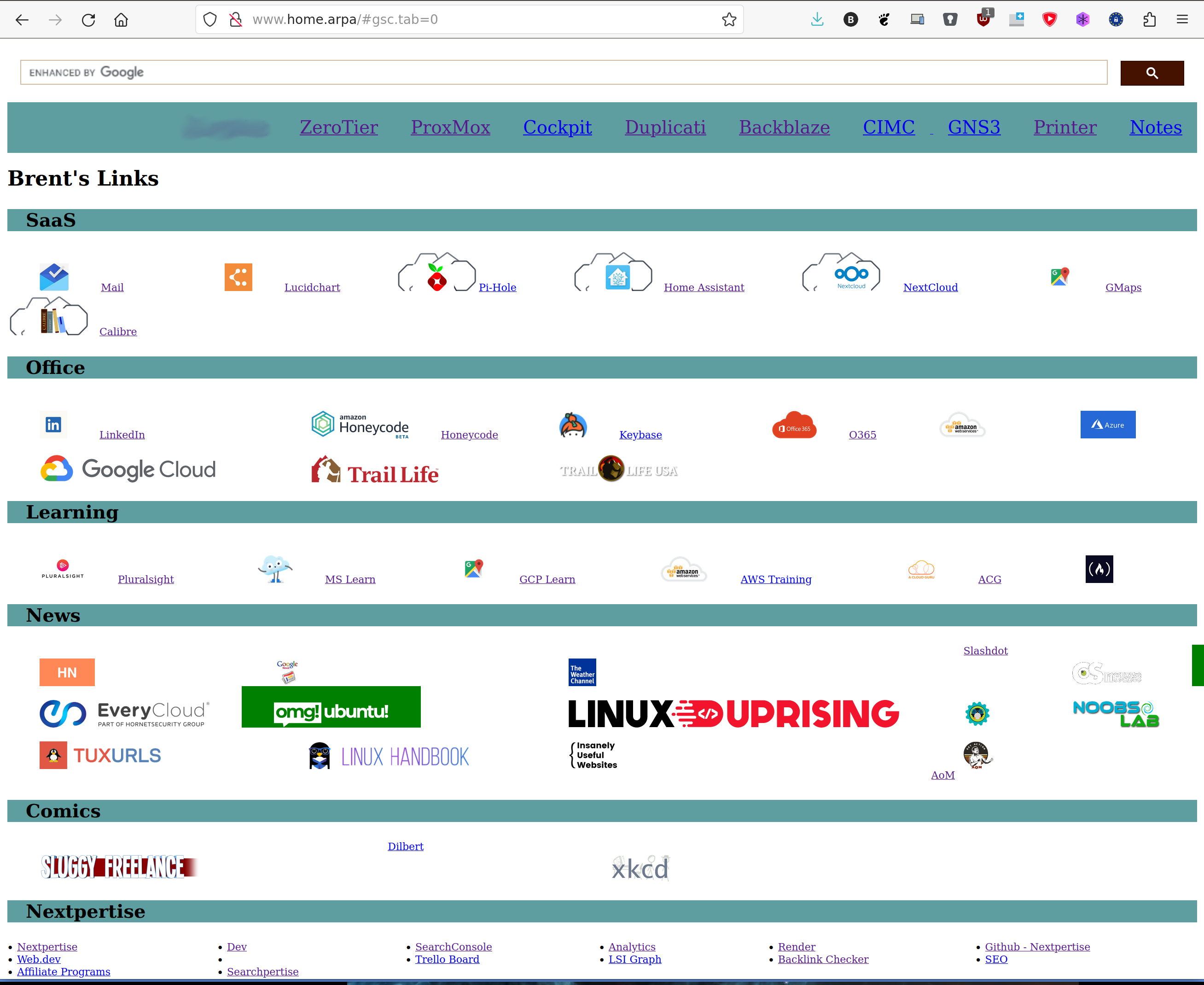 The first option is to Build Your Own. This is the option I’ve traditionally used. Running an Apache server is pretty easy, and I use my home environment as a training area so this forces me to understand the basics of Apache and HTML. Since I’m a router guy, I don’t get up to Layer 7 unless forced, so it’s a good way to force myself to be more technically rounded.
I’m using VS Code to write basic HTML and CSS (with flexboxes to space things out). I might delve into that setup in a seperate article. This has the advantage of being a teaching tool and being reasonably easy to maintain. It doesn’t include any dynamic elements and it’s not the smoothest presentation.
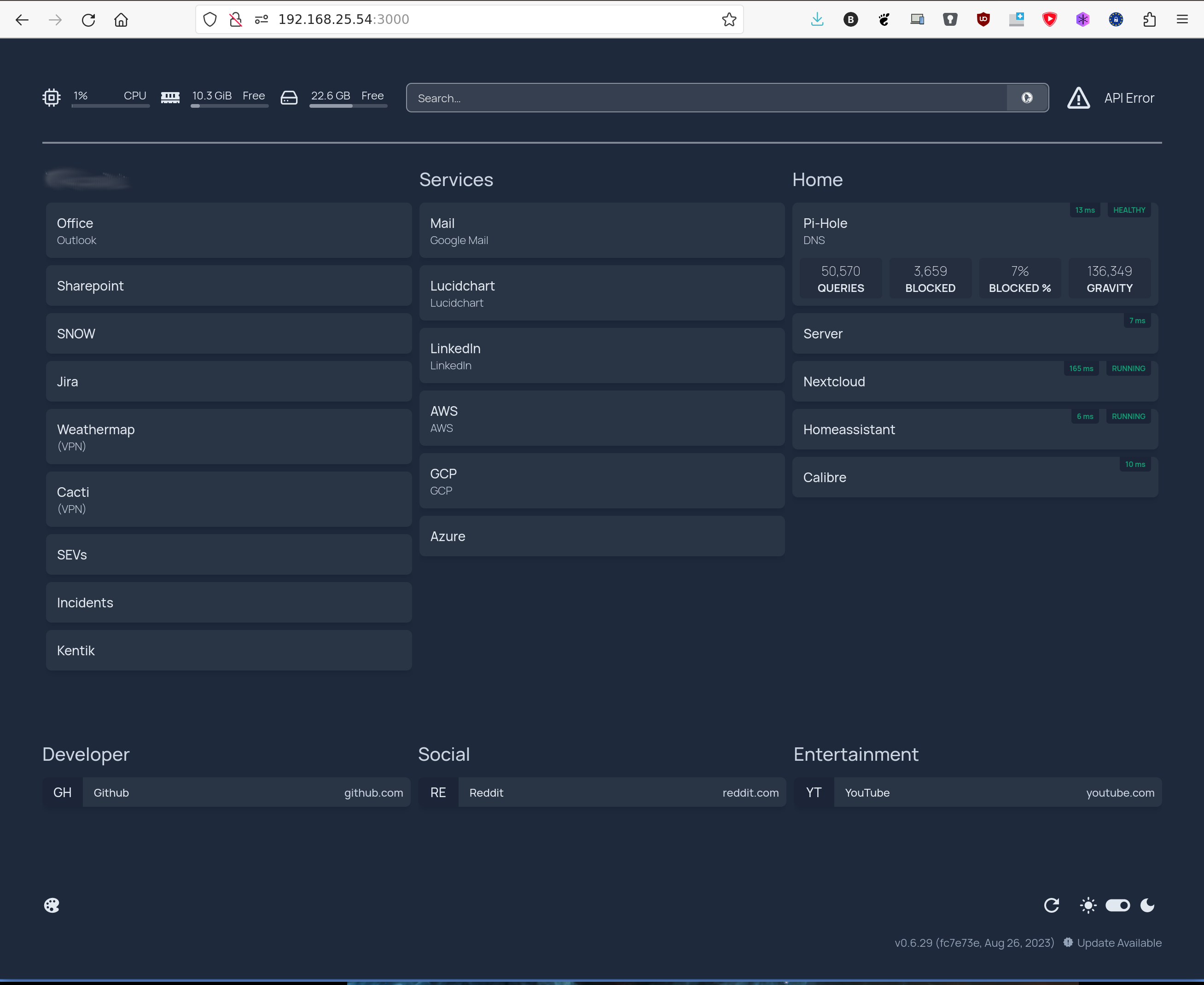
Homepage is a slick home dashboard that is available on Github. The dashboard features integrations and dynamic widgets for a lot of different services, like pi-hole and proxmox, and it can pull in information from different providers. I installed it via docker using a docker-compose.yml file that looks lie this.
version: "3.3"
services:
  homepage:
    image: ghcr.io/benphelps/homepage:latest
    container_name: homepage
    ports:
      - 3000:3000
    volumes:
      - /home/brent/homepage:/app/config # Make sure your local config directory exists
      - /var/run/docker.sock:/var/run/docker.sock # (optional) For docker integrations, see alternative methods
    restart: always
Homepage is easy to install. In the example, you can see that I’ve started to customize it and I was able to quickly approximate my old bespoke page. Homepage is configured by editing some YAML files, so it’s fairly easy to setup. It’s tedious, but not as bad as typing raw HTML. The container includes the web server, so this is really easy to fire up and use.
I liked Homepage. It’s performant, includes some dynamic status elements that I find valuable and would be hard to recreate by hand, and the documentation is reasonably good. Integrating webpage icons has been a little of a challenge, but setting up the pi-hole integration (for instance) was very straightforward. Moreover, it’s pretty.
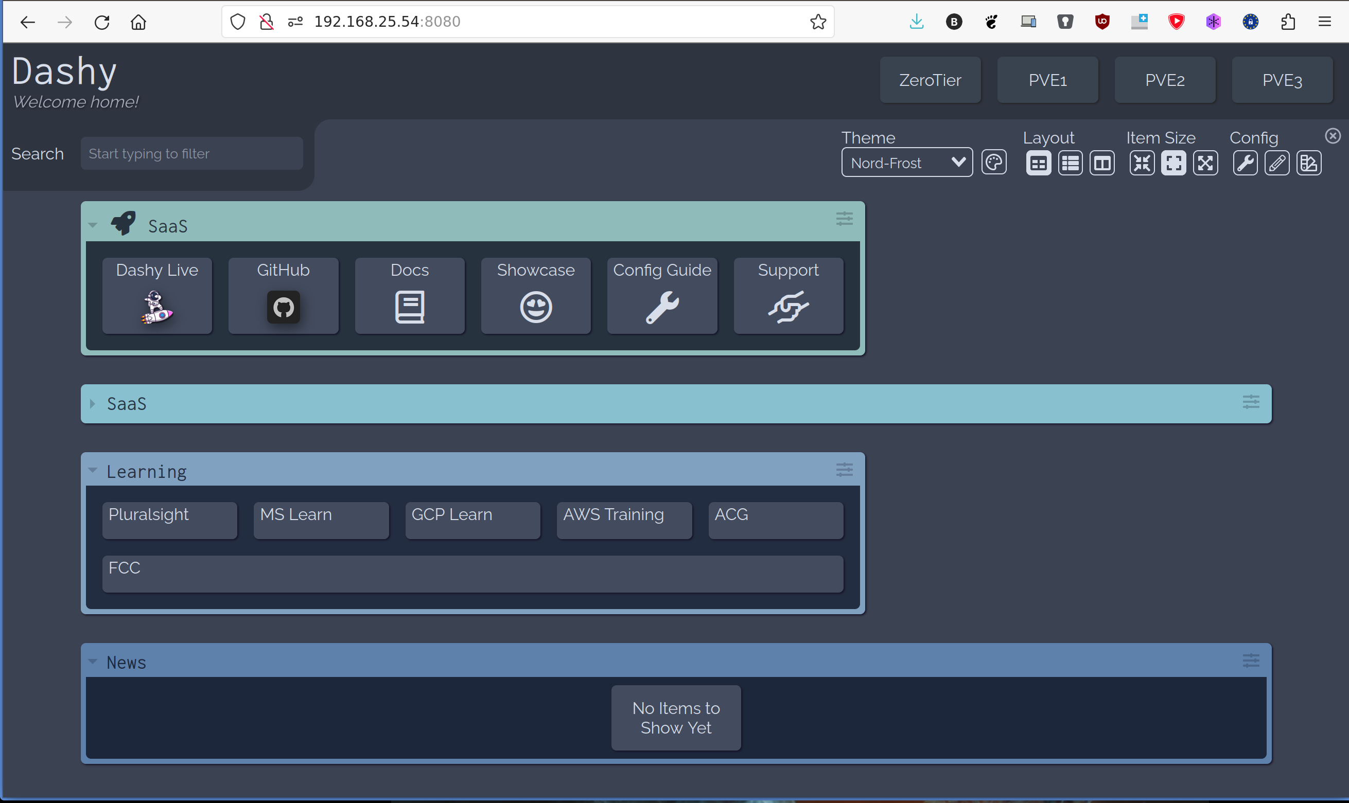
Dashy is another home dashboard, published on Github, that can be easily stood up via Docker. I found Dashy to be the prettiest option. Once the container is setup, Dashy is fully ready to go.
Customization is done via the UI to edit JSON. I’m not a big fan of editing JSON, but I can navigate it. However, I also found that Dashy sometimes honored my edits and sometimes lost them.
Dashy has a wide variety of really cool ways of grabbing a home page icon, but most of them will go out and grab the file from the website each time the page loads (remember the earlier tip!). I ended up referencing the icon files from my exisitng web server to solve the problem. Re-typing the same content when it was lost got tiresome though, and I ultimately left my time with Dashy feeling a little frustrated.
Here’s the docker command to deploy dashy.
sudo docker run -p 8080:80 lissy93/dashy
I’ll add a fourth option, although I think it’s only going to be best in certain situations. Consider using Home Assistant to build your home dashboard.
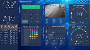
Home Assistant is awesome and you should run it in your home. It’s a great way to consolidate a lot of IP-attached devices. You can build a dashboard to control them, you can build automations (such as having lights come on at sundown), and you can pull many devices together to create “scenes”. A scene might be just area lighting to create ambiance for an intimate dinner, for instance, and then anther scene could be all the lights on for cleaning up.
You can use Home Assistant’s dashboard to embed web links. I was able to use the Markdown card to add a group of links and include images. There’s also a card to embed a webpage into your dashboard, and integrations for things like monitoring a pi-hole or proxmox server.
Setting up Home Assistant using docker looks like this:
sudo docker run -d --name homeassistant --privileged --restart=unless-stopped -e TZ=EST -v /PATH_TO_YOUR_CONFIG:/config --network=host ghcr.io/home-assistant/home-assistant:stable
Home Assistant is fairly easy to setup and would allow integration with IoT controls. I found that the card system eats up a lot of screen real estate and it would be hard to have a lot of links, but this is a nice middle ground between something like homepage and building your own.
Obviously HA can be uber-customized. The screenshot on the right is from their example page and there are a lot of ideas on here that I don’t know how to recreate. You can really make this dashboard sing, so take a look at their example pages.
My first conclussion is that these were all pretty easy to setup and test. So I’d suggest you give them a try and see what you think. As for me, I really like where Dashy is going but found it frustrating in it’s current state. Using Home Assistant as a start page was tough because it didn’t give me a lot of control over layout and didn’t support a lot of density, but I could see how this could be the right option. Homepage seems good, but I think for now I’ll continue to hand code it to get that experience.